The Passion Project (part one in a series of who knows how many)
"You can’t predict where a project is going to lead. It could have as easily turned out that Marcel’s letters weren’t interesting or noteworthy. You just don’t know, right? Be curious and open to what unfolds." -- Carolyn Porter
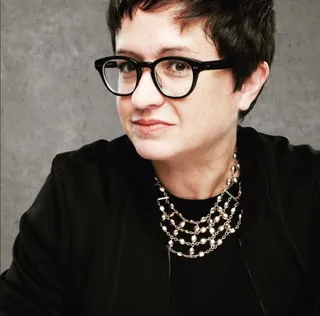
To my new subscribers, thank you so much for allowing me in your inbox every Friday. This little newsletter is a passion project of mine that allows me to tell you stories about interesting people, history, and other things that pique my curiosity. And boy do I have a treat for you today! It's a conversation with graphic designer and author Carolyn Porter, whose fascinating book Marcel's Letters came out at the same time as my first book, The General's Niece. We first connected on the artist formerly known as Twitter and bonded because we were newbie authors of books about World War II. Then, when I went to Minnesota last year with my kiddo to tour the Minneapolis College of Art and Design, she met us for dinner at Owamni and then circled the block outside of First Avenue so I could take a dork selfie with Prince's star. Bottom line: I love Carolyn to death (and not just because of the aforementioned caper). She's an awesome human who just celebrated the tenth anniversary of an exquisite font she created, and I just know you will be inspired as I am by her and her incredible journey.
How did you become interested in font design?
My background is graphic design. In college I took a letterform design class, which is where I first learned to think about the shape, form, and character of type. It was one of my favorite classes.
As a graphic designer I work with type every single day. It’s my job to help clients understand how typography can impact communication and elevate a brand.
Related to that, I have an affection for handwriting — old handwriting in particular. I love the look of scratchy old cursive dancing across a page. Twenty five years ago I read an article about the first computer font that mimicked the look of scratchy old handwriting. The font, named Texas Hero, was designed by a graphic designer named Brian Willson. It was a eureka moment for me, and I knew someday I was going to design a font based on old handwriting. I didn’t know how to do it, but the fact Brian was a graphic designer gave me permission to think I could design a font, too.
What is the secret to creating a good font?
Great question. I think a “good” font is defined by how you want to use it and if it meets your needs. For example, you could be working on a grunge design project where type needs to be distressed and barely legible. Or your design might need a delicate font with lots of ornate, scrolly optional characters. Or you might need a font that supports indigenous languages. All of those fonts could be considered “good” for very specific reasons, even though they might not have any common visual characteristics.
That being said, there are plenty of treatises on ideal shapes and form of letters. And there are specific expectations for the functionality of font files.
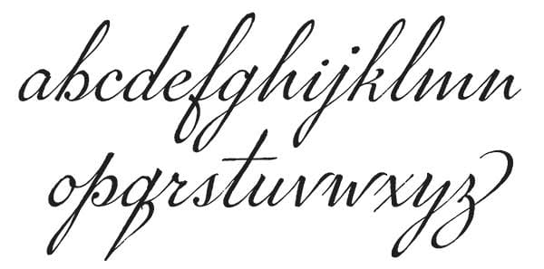
The font I designed is a connected cursive script, and there is one technical thing about script fonts that makes them shine: the connection stroke between letters. It’s a challenge to design every single letter so that no matter what letter goes before or after, every connection is smooth. That’s the hardest thing about designing a script font. Those connections make or break a design.
Tell us a bit about discovering Marcel Heuzé: who he was and how his story became a passion project for you that resulted in a book and a font based on his handwriting?
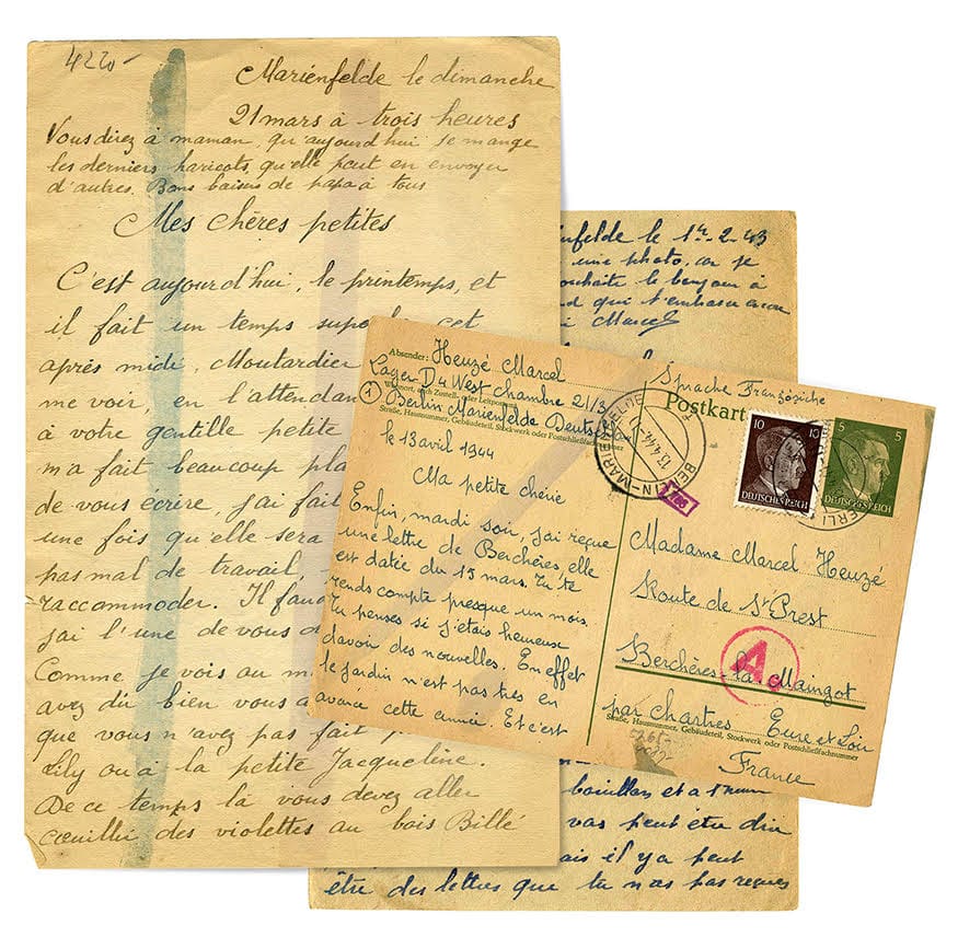
For a couple of years I had been keeping an eye out for the perfect reference sample for my font. I didn’t know exactly what it would look like or whose old handwriting it would be based on, I just figured I’d know it when I saw it. I saw Marcel’s handwritten letters at an antique store in Minnesota and knew immediately those letters would be the perfect reference sample. Having access to multiple letters meant there was enough material to let me piece together most of the alphabet, giving me all the building blocks I thought I needed. I brought the letters home, scanned them in, and started working on the font. The original letters were tucked away in a closet.
Initially I didn’t think much about the contents of Marcel’s letters. After working on the font off and on for nine years I realized I knew his handwriting intimately — but I didn’t know anything other than his name, and the fact the letters had been written during WWII. I tried to translate one letter using Google translate, but it was a mess, so I hired a translator. At that point my interest was a curiosity. A whim. I thought I’d ‘scratch the itch’ to learn who he was and go back to working on the font.
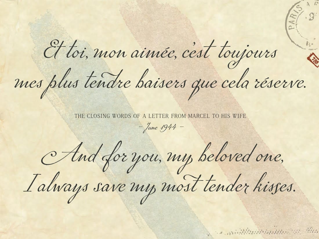
It turned out the letter was indeed a love letter (as I hoped and suspected), but rather than being written to a wife or girlfriend, the letter had been written to Marcel’s three young daughters. The letter included tender words of fatherly advice. He ended the letter, “Please give my love to your mother, hug her a lot, and the same for Grandma, too. Your Dad who sends his love from 1300 kilometers away. Your Dad who thinks about you all the time. —Papa” The letter didn’t answer any of my questions about who he was, and it raised so many new questions. So, I had a second letter translated.
I assumed the second letter would tell me why Marcel had been writing from Berlin to France during the middle of WWII. What I ultimately learned was that he was one of many thousands of ordinary French men forced to go to Germany and work for the Germans. Marcel was at a Daimler factory that manufactured tanks, and the second letter included frank testimony about life inside a labor camp.
Reading the second translation launched an obsession to learn more: Who was he? Why he was in Germany? Why were his letters for sale at an antique store in Minnesota? What happened to his wife and three daughters in France? And the big question: Did Marcel survive to be reunited with his beloved family?
The quest for answers would consume the next year, result in a trip to France, and eventually turn into a book. But more than just a quest for answers, the project became personal: I felt a deep obligation to ensure Marcel’s story was not lost to time.
The font was released in 2014 and is named Marcel Script in his honor. The book was published in 2017 and is titled “Marcel’s Letters: A Font and the Search for One Man’s Fate.”
What was it about Marcel’s handwriting that was so appealing?
Even though I don’t speak or read French, I could tell the letters had been written with affection. You wouldn’t expect to see a letter written to a lawyer or grocer or landlord with a sweeping greeting. From the get-go I imagined these were love letters. The letter ‘M’ in the greeting “Mes chères petites” was particularly beautiful.
Years after the book had been published I learned something interesting about his handwriting. I had always thought of his writing as ornate, but I learned his style of writing was classic “blue collar” handwriting. At that time in France, students were put in one of two tracks: an intellectual track where they’d go on to be a doctor or lawyer or such, or they were put in a track where they’d go to school until the age of 14 or 15, then learn a trade. The two groups were taught different styles of handwriting. Marcel was a tool and die maker, so he was taught the simplified style, though I’ve always considered it fancy!
How long did it take you to create the font? What did that process involve?
It took 12 years, working evenings and weekends. To be fair, there was a lot of starting and stopping, and at times months would go by when I wouldn’t work on it. At that point I didn’t know any other type designers, so I didn’t have anyone to turn to when I’d get stuck. I lost a lot of time to trial and error (and error and error and error). It’s easier now because there are online tutorials, videos, forums, and any number of online classes, but at the time I was figuring things out on my own.
I used software called FontLab. Though there may be common characteristics to letters (e.g., a serif or some other modular component) there’s really no shortcut: every single letter has to be designed individually. One thing I love about type design is that it requires both creative and technical thinking.
Since releasing the font ten years ago, how has it been used? What did you learn from this journey of discovery?
I’ve seen the font on book covers, magazines, wedding invitations, greeting cards, social media graphics, and merchandise like hats, scarves and tea towels. During COVID I even saw it used on face masks and memorials.
The font is distributed through resellers, so I don’t know when I’m going to see it “in the wild.” One of the first times I saw it in use was at my local Barnes and Noble. A rack of new releases was just inside the front door, and the font was on the cover of Anna Quindlen’s book “Miller’s Valley.” I saw the book, gasped, and proclaimed — loudly, I might note — “holy shit!” Then I gasped again, realizing I had just cussed and I looked around for small children who may have been within earshot.
What did I learn from the journey?
You can’t predict where a project is going to lead. It could have as easily turned out that Marcel’s letters weren’t interesting or noteworthy. You just don’t know, right? Be curious and open to what unfolds.
This journey has also resulted in crossing paths with — and making friends with — people I would have never met otherwise. Life is bigger and richer because of this project.
Any advice for people who want to find a passion project of their own?
Don’t overthink it. Jump in. Try your hand at something. Or at multiple somethings. Explore. Play. Fail.
Trust that you’ll know what that thing is when you find it. There will be something inside you that whispers (... or maybe shouts) “this is it; this is the thing you need to do.”
Question: Have you ever had a passion project? If so, what was it? If not, why not? If you could have any passion project, what would it be and why? Please reply to this email (or leave a comment) with your answers. I may share some in a coming issue.
"The universe is full of magical things waiting for our wits to grow sharper."
– Eden Phillpotts, playwright
According to an article published on inc.com (and tons and tons of research), there are a lot of good reasons to immerse yourself in something that's not tied to profit. Among them:
- Strengthening your skillset
- Having the freedom to practice something you enjoy
- Adding meaning and fulfillment to your everyday life
- Continuously learning something new
- Making new friends along the way
Turn down for...Zen?
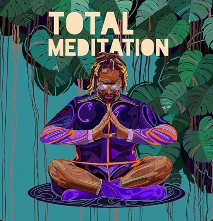
When I think of the DJ, record producer and rapper Lil Jon, I think of the following words and phrases: loud, party, throbbing bassline, yeah, and zero inhibitions. I see him crowd surfing (as he did during Usher's Super Bowl halftime show) not...in lotus pose, which is perhaps unfair because he just released a really good guided meditation album that I've been listening to every morning since it came out. Talk about a passion project! The album has eleven, ten-minute meditations that aim to boost focus, relieve anxiety, and enhance relaxation, among other things. It's manageable for people who feel they don't have time to meditate, and accessible for those who have never tried it. Best of all, somehow the album finds the sweet spot between helping you chill, and quietly (and sometimes hilariously) reminding you that the King of Crunk is your guide.
In closing...for Kelley, who wanted a picture of my dog, Boots
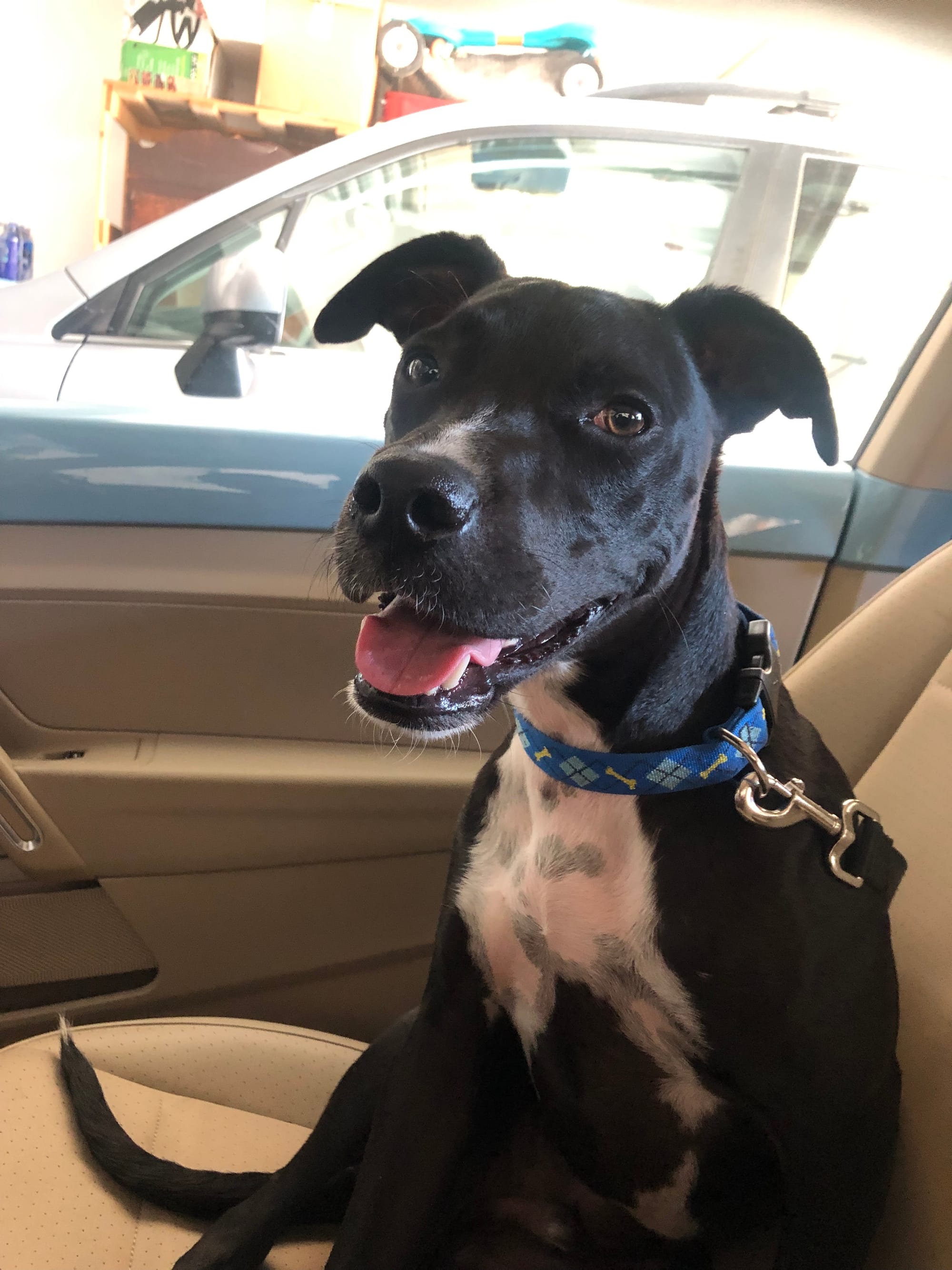
Boots' passion projects include eating cheese, treating the living room like an agility course, and flirting with strangers.
Thank you for allowing me to visit your inbox each Friday with these tidbits. If you know someone who might enjoy this newsletter, please share it with them and encourage them to subscribe for free. Each week(ish), I'll be sharing an eclectic range of stories and so forth. Sometimes I'll throw in a little bit of writing advice, and answer whatever questions you may have. It's a work in progress, rooted in my passion for writing about history, people from all walks of life, and the various things that interest me. I hope you find these things interesting and maybe even helpful, too!
Paige Bowers Newsletter
Join the newsletter to receive the latest updates in your inbox.


)